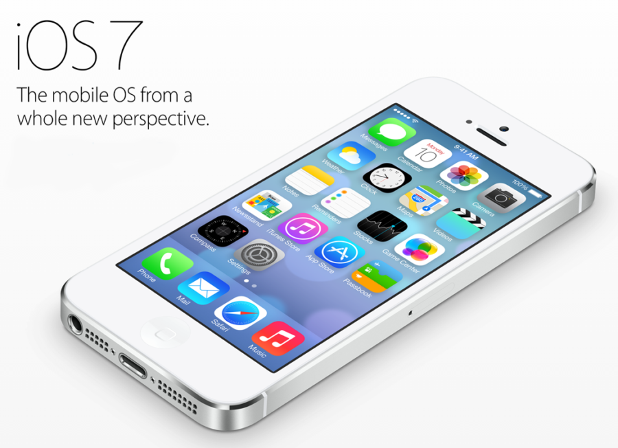
All the buzz in the technology world turned to Apple’s new iOS 7 update released Sept. 18. It’s a complete overhaul in terms of how the operating system looks and functions, but it’s definitely not perfect, coming with a new set of flaws in exchange for a cleaner and simpler look.
Let’s start with the first thing that everyone will see: the lock screen. Upon turning on the screen, the traditional black transparent bars on the top and bottom of the screen are gone and the sliding arrow now looks like a greater-than symbol.
As soon as the home screen is unlocked, the icons for the applications look… different. Different as in simple and clean, which is a good thing. However, only the first-party applications’ icons have changed. As for the rest of the more than 100,000 third-party applications out there, their icons will look like they did in iOS 6.
With this in mind it looks essentially like a hacked iPhone with a new wallpaper that can change the skin of the user interface on it. Will updates roll along from third party applications to update their icon’s look into the same, simple and clean one as Apple has done for their first party applications? I sure hope so. It may not affect how the iPhone works, but it sure affects how it looks.
Performance-wise, the iPhone’s battery dies more quickly with the new operating system. There are still a lot of bugs and a noticeable lag when using an iPhone for everyday tasks, but hopefully Apple can be quick to catch these and fix them with future updates.
One of the best improvements in iOS 7 is the addition of the Control Center. It works basically like the Notification Center before it, but for this one swiping up from the bottom of the screen brings up an array of settings much like Android devices have used, such as the brightness, WiFi toggle, Bluetooth and Airplane Mode, as well as quick access to the Music Player, the phone’s flashlight (previously only available through third party applications), the calculator, the camera and the timer. Also available in the Control Center, but only for the iPhone 5 and 5S, is the addition of the AirDrop and AirPlay feature, which allow you to wirelessly share files with and stream content to other devices.
The multitasking capabilities have significantly improved by using the whole screen to portray screenshots of each application that’s being used – again, similar to what Android devices have had – and it’s easier to kill applications now by just swiping each one up off the screen. No longer will a finger have to expertly try to zero in on that tiny minus button next to the already small application icon, which is a relief. Unfortunately, there is still no “kill all applications” button, so you have to swipe each application up one by one to close them all.
Otherwise, there aren’t too many differences. Of course, there are a bunch of little changes within the app, but only in terms of looks and not so much as in terms of function. Another noticeable difference was that upon exiting each application while pressing the home button, a smooth animation minimized the application to its icon and the home screen gradually took over. It’s a small feature that’s so simple yet enjoyable.
So in the end is the update worth it? It’s free! Why not, of course it’s worth it – the addition of the Control Center alone is enough. As a matter of fact, I would have preferred the original look and just the Control Center added, but unfortunately Apple decided to “revolutionize” the whole operating system. The look in general is clean and simple which is nice, but unnecessary. The removal of the transparent black bars on the lock screen, the Control Center, and the Multitasking are the most innovative improvements and additions in this update and for that, the update deems itself worthy.


